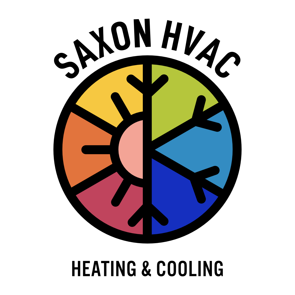

The client also wanted to attract a wide range of clientele ranging from private to commercial, and was passionate about making it clear with his logo that he is accepting of the LGBTQ+ community. He is located in a fairly conservative area and has found that some of the other companies in the area refuse to do business with the LGBTQ+ community.
With all of these factors in mind, I combined the simple type face from initial designs, with color elements that reflect the HVAC classic colors and expand upon them to act as a signal to the LGBTQ+ community, and drew the icon portion of the logo to show half “heat” represented by the sun and half “cold” represented by the snowflake.
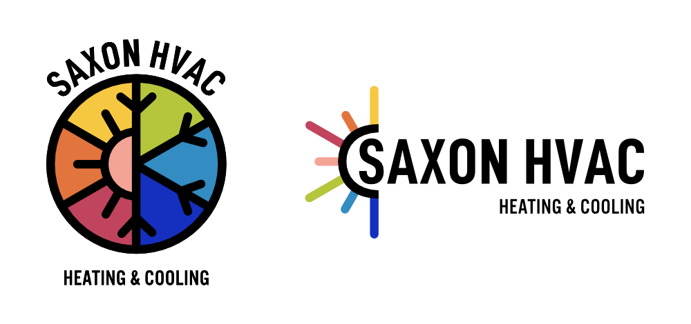
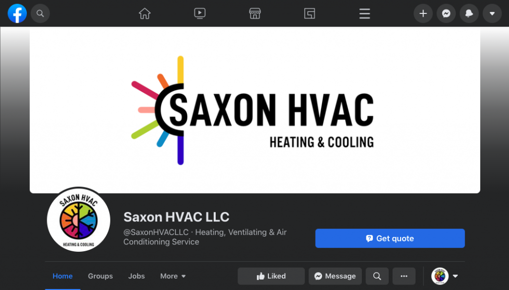
Two versions of the logo were created: a circular version that is meant to be used on vans and in instances where a more even aspect ration is needed, and a horizontal version that is meant to be used on letterheads, quotes, invoices, and business documents. I expanded upon the color logos to create variations to suit any need the client might face.
Facebook Page
Website
Van Decals
Photos coming soon!
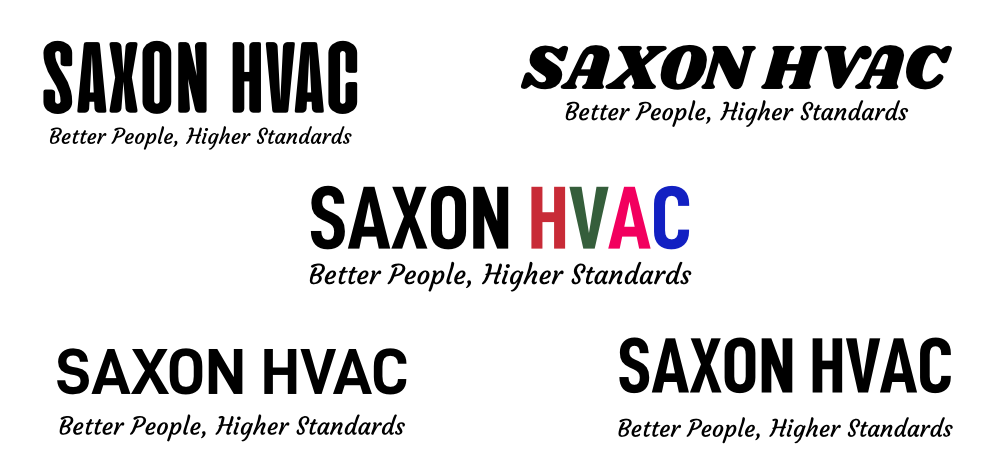
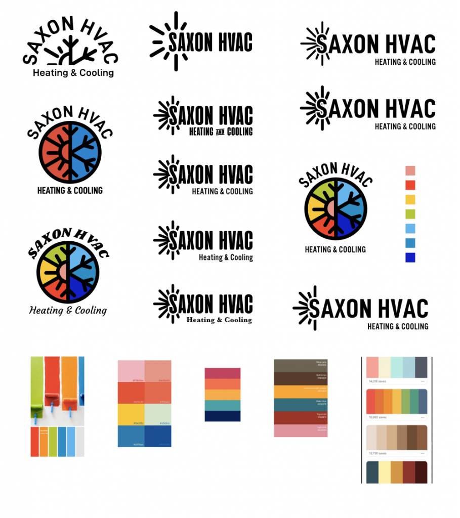
Logo iterations during brainstorming