Maurica James

#OpenToWork | Graphic Designer | Grafikdesignerin

Level Up Concierge Physical Therapy Logo

Paul James and Kelly __ started Level Up Concierge Physical Therapy after working in the industry for a combined X years. When we were initially discussing the general look and feel of the logo, we talked about including blue, teal, and grey. They wanted to add some graphic element to the logo to visually represent the concept of leveling up, and to visually communicate a higher standard of service and care.

All
Logo Design
Uncategorized

I did some research on Pinterest and pinned a bunch of ideas related to physical therapy & healthcare related logos and we started from there. I have embedded the Pinterest board below to give an idea of where we started.
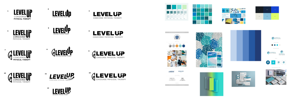
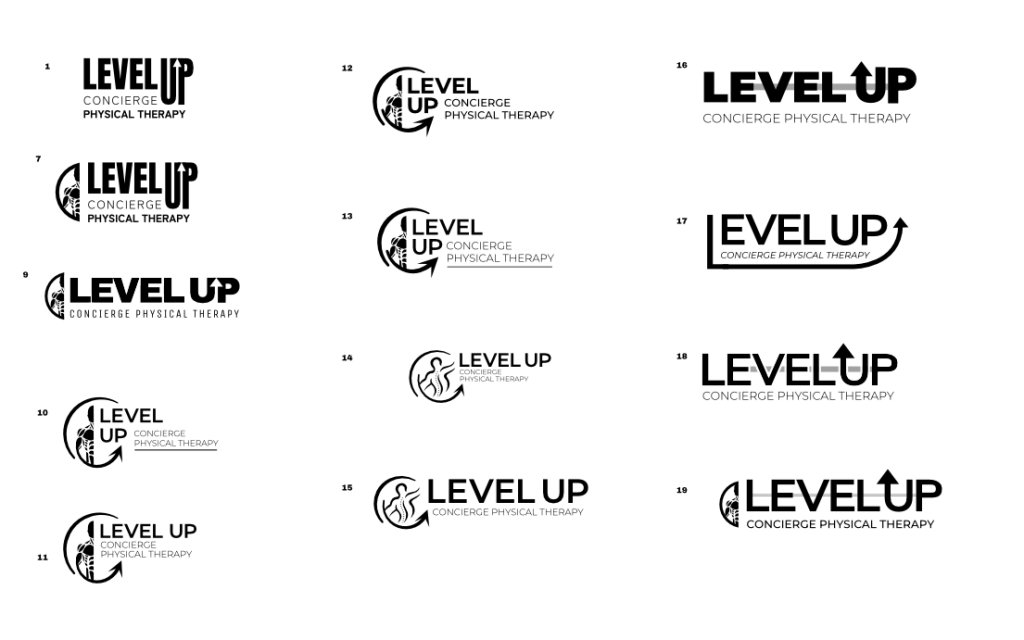
From the Pinterest board, I was able to get feedback on preferred fonts, and graphic elements for the logo and from those, designed the first iteration of logos.
With the second iteration of logos, I was asked to expand on the options with graphic elements including the human form to work more into the physical therapy/body/movement aspect of their work. The biggest challenge with the logo design was balancing the hierarchy of the graphic elements with the name, or didn’t feel like each element fit together enough.
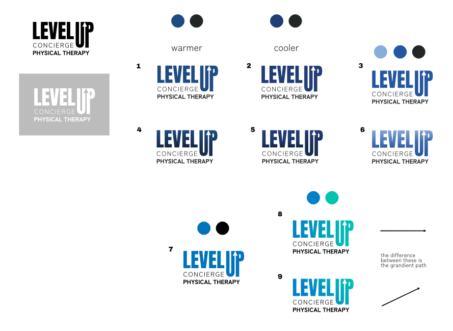
The version of the logo that balanced these items the best was actually the first version I created. Bold, clean, modern san serif. I moved on to include the color elements we had initially discussed. First I went the more traditional medical blue color I had seen in many healthcare related logos. Then I thought about how they were based in Florida, and many of the blue to teal color schemes I had seen looked practically tropical – ideal for their location and client base.

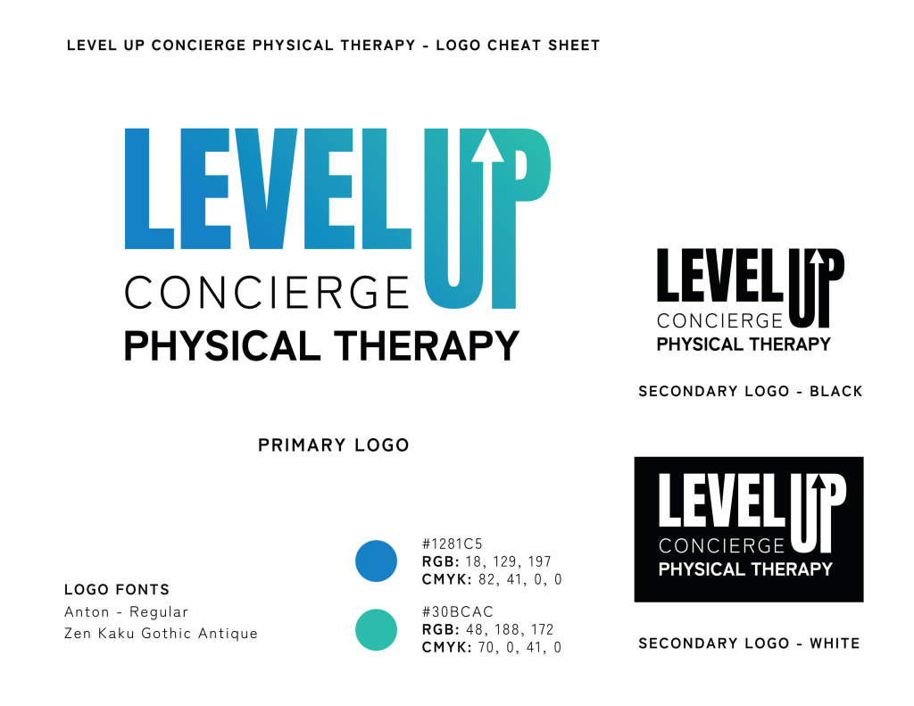
I’m super pleased with how this logo turned out and feel it will be a long lasting logo in terms of trends, colors, and versatility.