Cover design
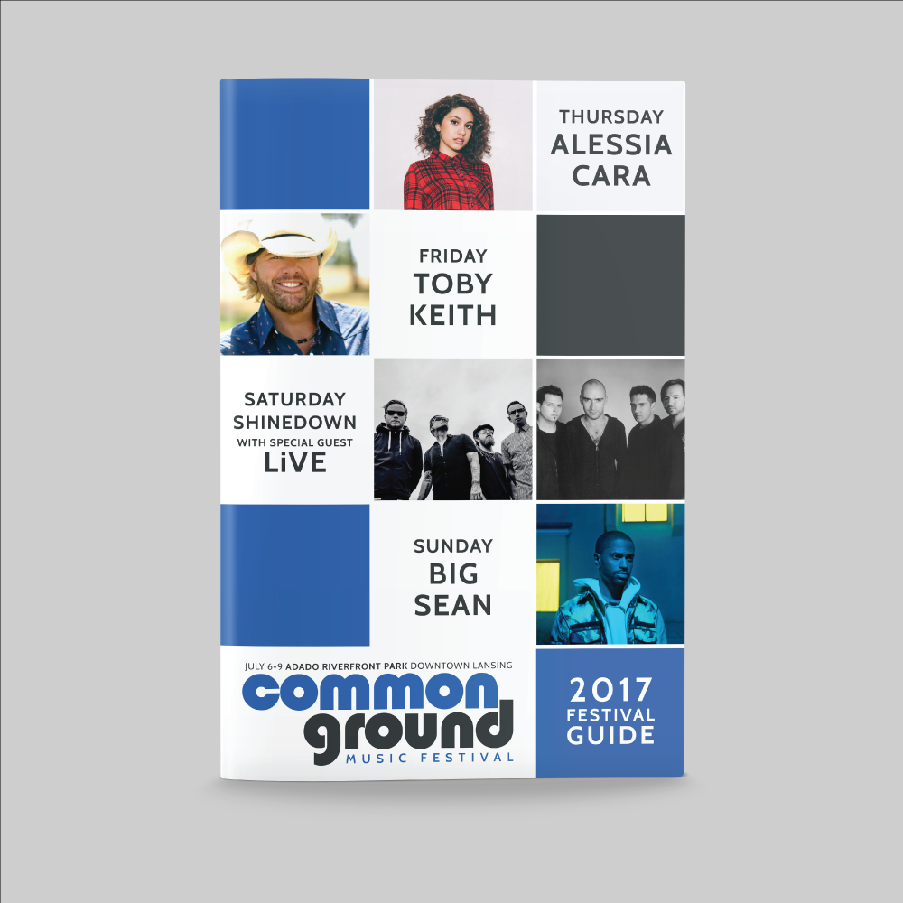
Each year that I’ve designed the Common Ground festival guide, I have tried to think of different ways to showcase essentially the same information: logo, year, and headlining artists. I treated each cover as if it was an art piece where each could be potentially framed by the other and would be unique in design but clearly follow the same brand guidelines.


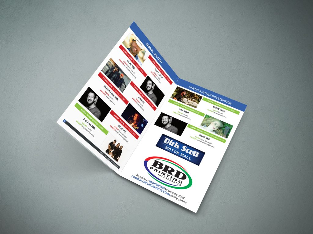
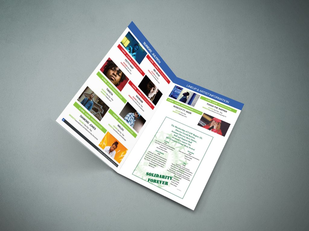
In order to make it clear which stage each artist was playing on, I color coded the stages in the festival guide and on the festival signage. Originally all the times and locations were the same color, and when I would work the event I noticed guests would sometimes be confused about which stage each artist was performing on. They would get lost in the hierarchy of information and miss the part where the stage was listed on each artists section.

